Current Flag:

This is an SOB, but I can see a good flag within it. Do you see the sun rising over the water? I think that could make a great flag.
My Redesign:

What did I tell you? This flag represents the sun rising over the great lakes.
Current Flag:

This is an SOB, but I can see a good flag within it. Do you see the sun rising over the water? I think that could make a great flag.
My Redesign:

What did I tell you? This flag represents the sun rising over the great lakes.
Current flag:

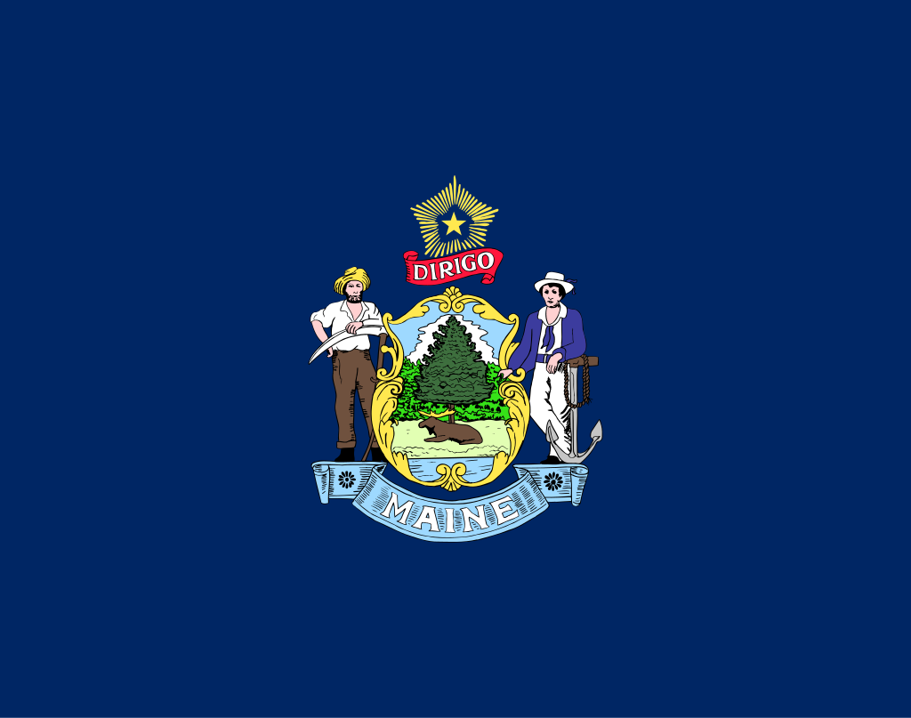
Seal on bedsheet. I have no words.
Variant Flag:

This is okay, actually. Pine tree is drawn from the New England flag. Still, white fields are annoying.
My Redesign:

The pine tree is from the New England flag, and the shield from the old reverse side of the flag. The red field is also from the New England flag.
Current Flag:

I actually really like this flag. Although it isn’t simple, it’s very memorable and the color scheme is great. Wouldn’t touch it if I wasn’t committing myself to this project.
My Redesign:

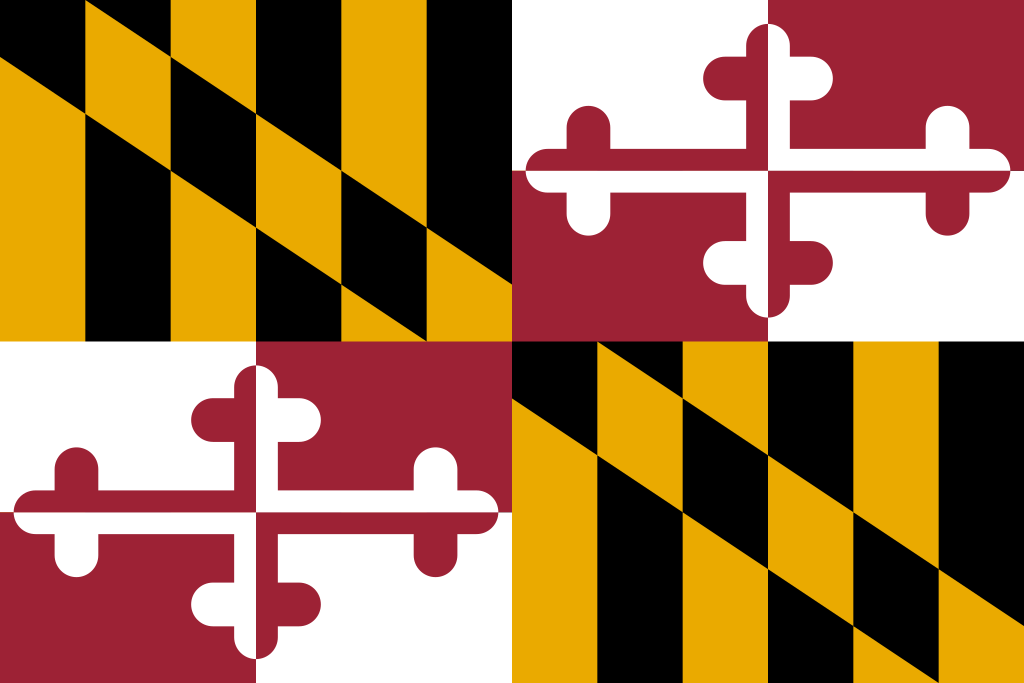
I used the Crossland Banner, which is more recognizable, with the Calvert color scheme. Sorry for the white spaces. This is a combination of two PNG images from SVG images of the Crossland banner reversed and normal from a Wikipedia downloaded PNG.
Current Flag:

This is just Idaho all over again. However, there is a better flag, the 1901 State Flag, which is much better. That and the Maine Naval Ensign are what my redesign are based off of.
My Redesign:

I used the same colors and most of the same design as the 1901 flag, but I used the simplified pine tree from the naval ensign.
Current Flag:

This is actually pretty good. However, if you look at the Seal of Louisiana, you realize it’s just a S.O.B. in disguise. Sad.
My Redesign:

I used a symbol of Louisiana, the Fleur-de-Lys, to make the flag. This symbol is in the canton, and there are 18 stripes in the field that represent Louisiana as the 18th State.
Current Flag:

This flag is a classic seal on bedsheet. The proportions hurt my eyes. Who makes a flag that long? Ugh. The motto is nice, though.
My Redesign:

This flag is supposed to represent the seal of Kentucky. It shows unity and peace between different people, as is illustrated with the pattern in the middle.
Current Flag:

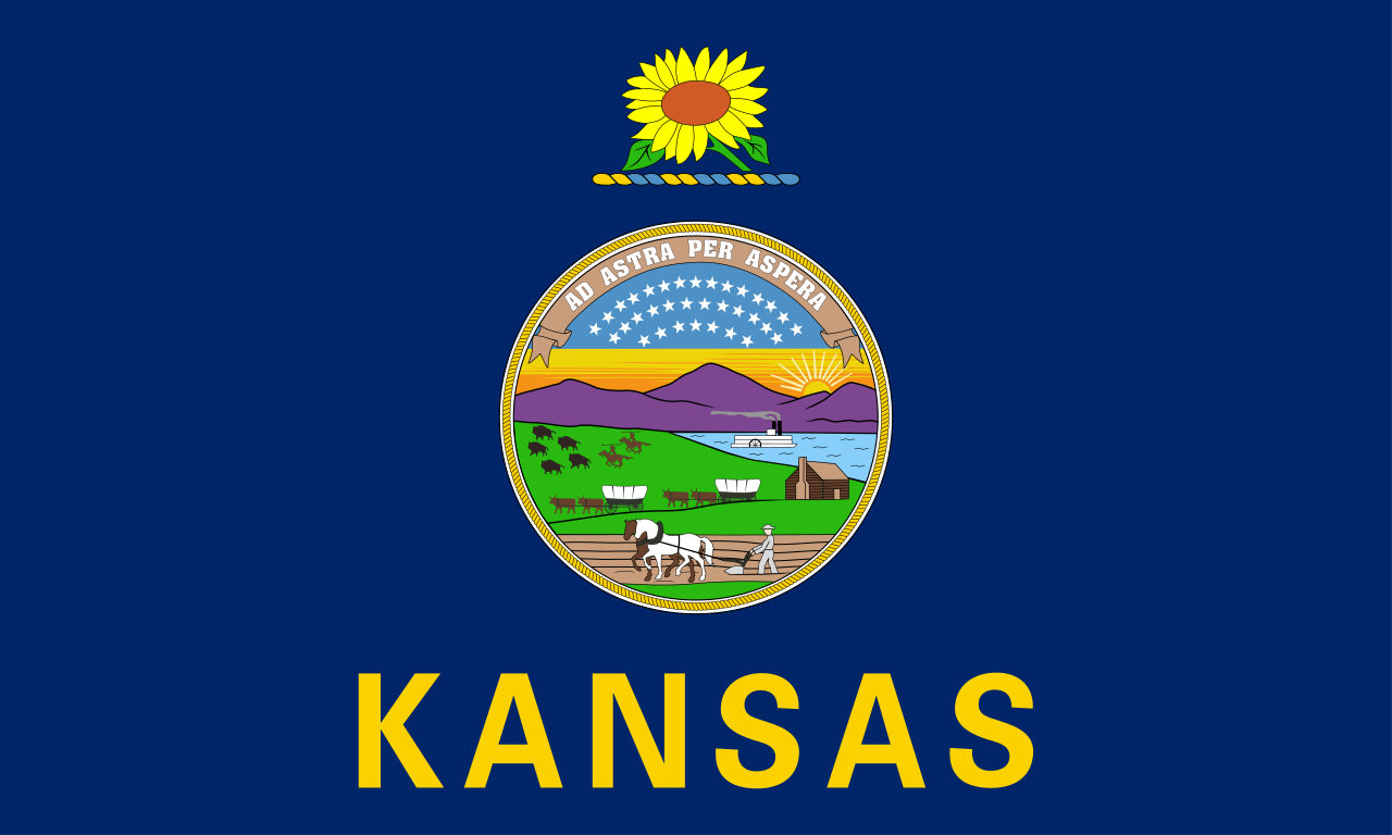
This flag is another state seal on blue field, but it was somehow made worse by adding “KANSAS” in big letters at the bottom. Only symbolism that can be viewed is the sunflower (Kansas is the “Sunflower State”), but the seal has symbolism as well. However, I don’t think that counts, because that symbolism can’t really be seen when the flag is being flown.
My Redesign:

My flag features a blue field, but there is actually symbolism. The sunflower represents Kansas as the Sunflower State, and the 34 stars represent it as the 34th State.
Current flag:

This flag doesn’t seem to represent much, but I love the colors and the motto. It is a Canadian Pale (new term I learned today) featuring the colors blue, white and orange.
My Redesign:

I kept the triband, I thought it looked nice. The two stars represent the two parts of the motto on the original flag, and the middle star represents the State of Iowa.
Current Flag:

I think this flag has good meaning, but it’s too complicated. The big star represents Indiana, the 13 small stars in a ring represent the 13 original states, and the 5 other stars represent the 5 states admitted to the Union between the colonies and Indiana.
My Redesign:

I basically took out all the complicated stuff that wasn’t needed. The rays, stars, and text are all gone. I also made it a triband.
Current Flag:

At least this isn’t a state seal on a blue field…It’s a state seal on a white field. Not much symbolism here.
Unofficial Centennial Flag:

I actually like this flag. It’s from 1918. The blue and white don’t seem to symbolize anything, but the 10 stars on top and on the bottom symbolize the 10 northern and southern states at the time, and the star in the middle represents Illinois.
My Redesign:

I decided to adapt the centennial flag. I took out the other stars, whose symbolism is obsolete, and inverted the colors, then centered the star.
My Other Redesign:

This is the first time I’ve redesigned a flag twice. The triangle is the shape formed by the small stars on the centennial flag, the green is a color on the current flag, it represents the olive branch from that flag, and the big star represents Illinois.