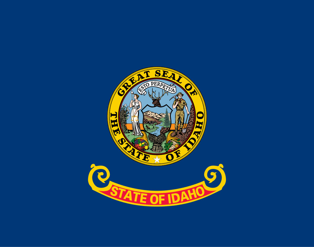
Current Flag:

Ugh. This flag hurts my eyes. Classic state flag. The seal is too flashy, and to top it off, the proportions are just scary: 26:33. (However, the US is 10:19, which is not as bad, but still.) According to Wikipedia, “The seal depicts a miner and a woman representing equality, liberty, and justice. The symbols on the seal represent some of Idaho’s natural resources: mines, forests, farmland, and wildlife.”
My Redesign:

I’m actually very proud of this flag. The purple is a substitute for the lady on the seal. (Purple represents justice in heraldry). The gem in the middle represents Idaho as “The Gem State.”


I really love this redesign. So simple, and yet so memorable. Strong images and colors, and still, evocative of Idaho.