Don’t waste your money on the 2021 Silver Dollars!

I’ve noticed that many people in the numismatic community have been very excited about the 2021 Silver Dollars. These are coins commemorating the 100th anniversary of the 1921 transition between George Morgan’s Morgan Dollar design and Anthony de Francisci’s Peace Dollar. The commemoratives have been getting a lot of positive attention from coin collectors, but I believe that buying these coins is a waste of money, and that they are essentially a scam from the US Mint.

There are really six coins: the 2021 Peace Dollar (Philadelphia), the 2021 Morgan (Philadelphia), the 2021 S Morgan (San Francisco), the 2021 D Morgan (Denver), the 2021 CC Morgan (Philadelphia), and the 2021 O Morgan (Philadelphia). The Peace dollar is limited to 200,000 mintage, and each of the Morgans 175,000. This is the first major problem with these coins: Forced rarity. The coins don’t have much metallic value—I’ll get to that later—but the low mintage (1.075 million coins total) is being used to justify their $85 cost, which leads to the second problem: the overvaluation.

Each coin is made up of 0.858 troy ounces of .999 fine silver. This means that their melt value—regardless of mintage—is about 23.71. This is obviously subject to change, but that number is based off of a silver value of $27.63/oz. The Mint, however, needs to make a profit, so it’s understandable that they would sell for over spot price. However, they are $61.29, or 259% over spot. The recommended highest premium for investors is 15%. However, this premium is only for coins with no numismatic value—which is why the Mint needs to force the coins to become rare. In addition, I generally don’t like that the Mint now uses .999 fine silver for commemorative coins instead of .900. Coins in .900 silver are more affordable, and also, if the Mint wished to mimic the 1921 coins, that would be the most accurate. I also really hate the O and CC privy marks—they serve no purpose and are just another blatant cash grab. If the Mint wanted to honor the closed branches, it would have been more appropriate to make a coin like the 2006 Old Mint Commemorative.

Overall, I think that the silver dollars are only deemed “rare” to justify their cost, which is unaffordable to many, and they are just a cash grab by the Mint. They’re in the wrong format—it seems they can’t decide whether to be bullion or collectibles. Don’t waste your money on these commemoratives; just buy the real things.

Mississippi’s New Flag: The Good and Bad

Just to clarify: although I will talk about some things that I find bad in this new flag, I do not in any way prefer the original 1861 Magnolia Flag or the 1894-2020 flag to this one. So, in November, the Mississippian voters picked a new flag. Their old flag, which I won’t show here, featured the Confederate Battle Flag, and to many in the state, represented oppression and systemic racism. Before the election, there were really five flags that were finalists, and the best ones of those were combined into this flag, which is now the official flag of Mississippi.

Flag of Mississippi.svg

As I said in the title of the post, there are good and bad parts of this flag. Let’s start with the good parts.

Firstly, the flag is an improvement because it features no Confederate symbolism. After all, that was the purpose of the flag. This is really the most obvious thing about it, good or bad.

Secondly, the symbolism is much better and richer. The Magnolia represents Mississippi as the Magnolia State, and the blue represents the Mississippi River. The gold represents Mississippi’s rich culture, and the red represents “Hardiness.” The twenty stars represent Mississippi as the twentieth state, and the gold star which stands alone represents the Native Americans who first inhabited Mississippi. “In God We Trust” is the state motto.

Finally, this flag just looks better than the old one. I think that the original was a little too bright, and not original enough. The symbolism was just the Confederacy and the United States.

Now for the bad. Granted, there are not nearly as many bad things as in the original flag, but there are some symbolism and design elements that I don’t really like.

Mainly, the “In God We Trust” motto. I really don’t like how much Christian symbolism the US government endorses and creates, and I also just don’t like text on a flag. I see no reason to put the motto onto the flag other than to endorse Christianity (which the government shouldn’t do).

I also think that the magnolia is a bit too complicated. I don’t hate it, but I would prefer a less complicated stylized magnolia.

So, based off all of this, here is my ideal redesign of the Flag of Mississippi:

I made very slight changes to the proportions and the red and gold bars, but more drastic changes to the magnolia and the stars. For the magnolia, I just did a simple stylized flower based off of the magnolia flower. For the stars, I moved them to the gold bars, and I changed every star to the type made up of the five diamonds.

Redesigning European Union Flags, day 7: Denmark

Current Flag:

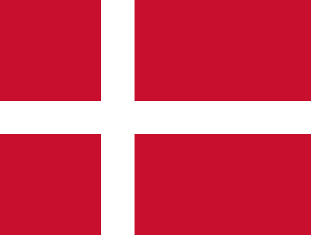
Flag of Denmark.svg

Another of the most beautiful European flags. According to legend, this flag fell out of the sky during a battle, but it really derives from a war flag of the Holy Roman Empire. It’s one of my favorite flags, along with the other Nordic Cross flags.

My Redesigns:

Redesign 1:

This redesign is based off of the Greater Coat of Arms of Denmark. I did the same thing that I did with the Czechian Redesign, removing all the complicated elements and keeping the basic structure and colors. I also shifted the design slightly so that it would keep with the Nordic Cross motif.

Redesign 2:

This flag is based off of the Coat of Arms of the House of Oldenburg, the first ruling family of Denmark. I think that it’s a good design, but I don’t like it as much as my first redesign, since it eliminates the Nordic Cross.

Change in Posts: More Politics/Cooking and a new Schedule

Hi everybody! I am here to announce that my posting will be changing. I am now going to set a schedule for myself. I’ll post on Tuesdays, Thursdays, and Sundays. I’m also going to do more political and cooking posts. I know I haven’t posted in a while, I’ve been depressed because everything I’m doing is remote. I’ve also been very busy. I’m still going to be doing the EU Flag series, but I’m going to mix it up with short political opinion and cooking posts. If I have more than one post for a day, I’ll schedule the posts for the next day. Scheduled posts will always be released at exactly 3 PM Eastern Time, so that’s how you can tell the difference.

My next two posts will be a continuation of the EU Flags series, and they will be released today and tomorrow. On Thursday, I will release a post about the new flag of Mississippi.

Redesigning European Union Flags, day 6: Czechia

Current Flag:

Flag of the Czech Republic

This is, honestly, one of the best flags in Europe. I doubt my design is an improvement. I think that the reason this flag is so memorable is that it is very recognizable without being a tricolor, so as not to be confused with another flag. I couldn’t find anything on the symbolism of this flag, but it’s really nice.

My Redesigns

Redesign 1:

For this redesign, I used the colors of the Coat of Arms of the Czech Republic without the detailed animals, and I put a star in the middle to represent unity between the Czech Lands.

Redesign 2:

In this redesign, I combined the flags of Bohemia, Moravia, and Silesia, the Czech Lands. Again, the star is to show unity. It also brings blue, the only Pan-Slavic color missing from this flag, into the design.

Redesigning European Union Flags, day 5: Cyprus

Current Flag:

I have never really liked this flag. I think that it’s because I don’t like having the shape of a country on its flag. Borders can fluctuate, even those with the sea. Also, this flag could look like a surrender flag if there was no wind. I think that the olive branch is quite nice though.

My Redesign:

No symbolism has changed at all. The white with the olive branch represents the peace between the Greek and Turkish Cypriots, and the orange represents copper deposits.

Redesigning European Union Flags, Day 4: Croatia

Current Flag:

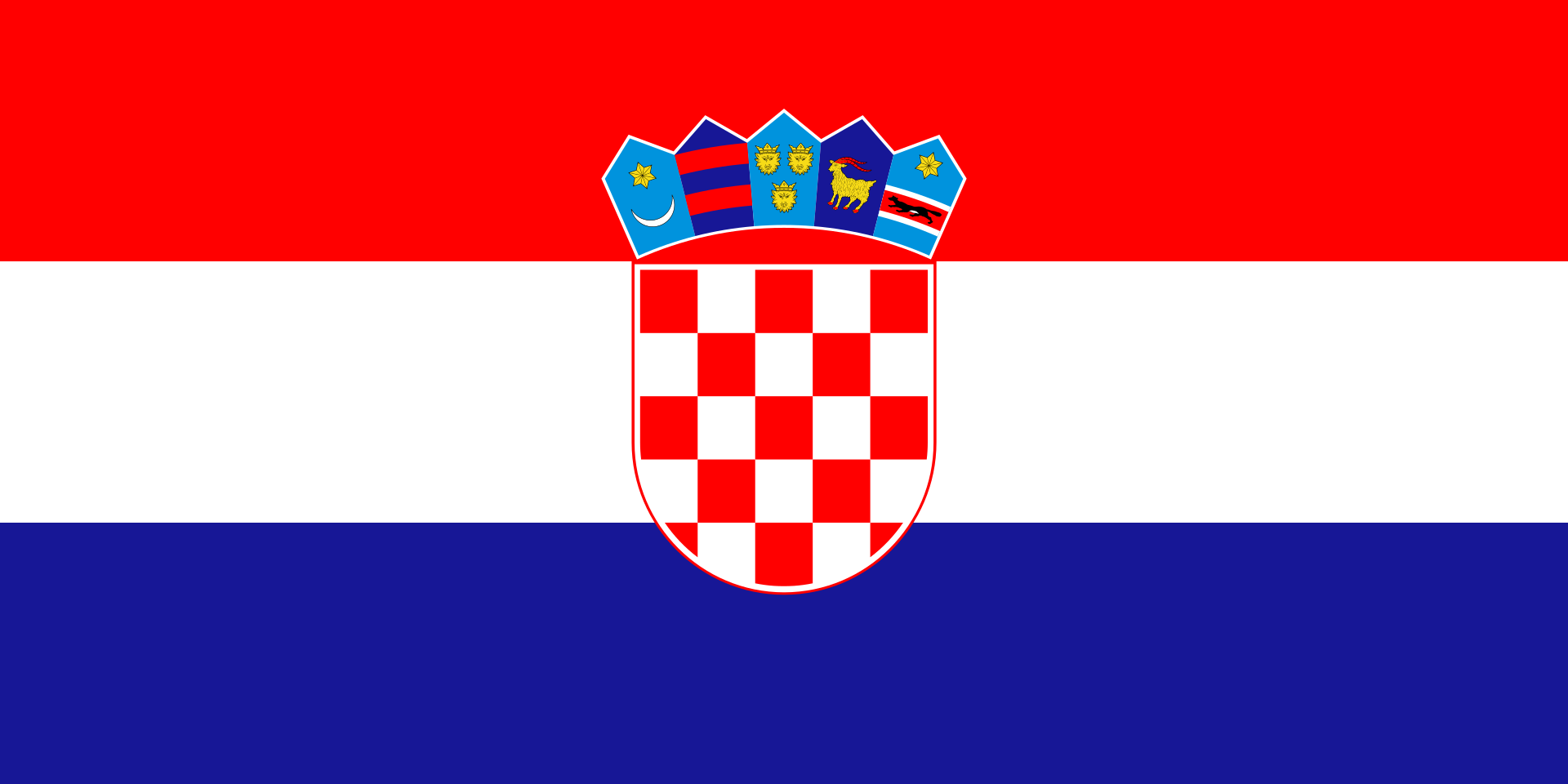
Flag of Croatia

I think this is an okay flag, but it’s easily confusable with the flags of other nations, such as the Netherlands and, to an extent, the other Slavic nations. The coat of arms in the middle isn’t too memorable either. I really like the crown of arms on top of the seal. The symbol on the far left is one of the early coats of arms of Croatia, and the others represent the regions of Croatia.

My Redesign:

I basically made a banner of arms of that symbol I mentioned earlier. I can’t really find anything on its symbolism, but I’m fairly sure that the crescent represents the Ottoman Empire. The star could possibly represent Hope, but I don’t know.

2020 United States Presidential Election

Hi! I thought I’d set up a poll to see who my viewers are voting for/supporting. It’s quite straightforward; you just say who you support and who you think will win. You can only respond once.

I’m proud to say that I’m endorsing Biden for the Presidency. His political ideology is very conservative from my perspective, but I think that he is the Democrats’ best shot at beating Trump. I’d like to hear your views, so please respond to the form here.

Redesigning European Union Flags, Day 3: Bulgaria

Hi, sorry I haven’t posted in a while, I’ve been a little overwhelmed what with all the news and the upcoming election, but here’s the next post of the EU Flags Redesigned Series.

Current Flag:

This is a really good flag, since it’s a tricolor, and I can’t make it any better. I can’t find anything about what the symbolism is, but the colors go really well together.

My Redesign:

As I said, I couldn’t make the flag any better, so I just added the lion from the Bulgarian coat of arms. I also changed the proportions of the flag to 2:3, of course.

Redesigning European Union Flags, Day 2: Belgium

Current flag:

Flag of Belgium.svg

Nice Flag! It’s a really appealing tricolor, so I can’t really make it better. The colors are taken from the unofficial former flag of Brabant. However, the proportions are really weird. 13:15.

My Redesign:

The basic design is taken from the Lesser Arms of the Royal House. I thought it looked kind of cool. The green band is a very simplified crown, and I actually don’t know what the stripes represent.