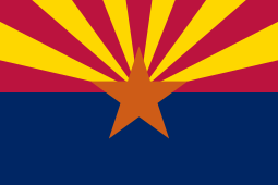
50 Days, 50 States; Day 3: Arizona

Current Flag: 

Flag of Arizona.svg

I think this flag is pretty okay. It’s not terrible but it’s not one of the great ones. According to Wikipedia, “The red and yellow…symbolize Arizona’s picturesque landscape…[and] the center star signifies copper production.” However, the blue doesn’t seem to represent anything. 

My Redesign: 

Image

I wanted a nice, simple flag for this one. I kept the original colors, but removed the blue, which didn’t seem to serve a purpose. I replaced the star with a circle, which is easier to see from a distance. 

50 Days, 50 States; Day 2: Alaska

Current Flag: 

Sorry for the bad quality!

I actually like this flag a lot. The blue and the gold combine nicely, and the North Star represents the state’s motto, “North to the Future.” I don’t really see any major things that I want to redesign in this flag. However, I must redo them all…

My Redesign: 

For this redesign, I kept the same colors, and the same idea of the North Star. I removed the Big Dipper and replaced it with an arrow/mountain, which represents Alaska’s mountains, but mainly its motto, “North to the Future.”

By the way: I still like the original flag better. However, I think mine is easier to draw.

50 Days, 50 States; Day 1: Alabama

Current Flag:

Flag of Alabama.svg

To me, this is one of the few state flags that is actually simple, good, and memorable. However, I see that attempt to sneak in the Confederate flag. Not cool, Alabama, not cool.

Redesign:

I made this with Scrontch’s Flag Designer. It’s good for simple flags. This one features a white field charged with a red cross, which is drawn from the original flag. It also features a cotton flower, a symbol of the south. I like this, because, unlike the Confederate Flag, it represents the region, but also gives remembrance to those who were enslaved in the past.

Sealand Redesign

So, I redesigned Sealand’s flag. Here’s the current one:

Image result for sealand flag

It’s okay, but I don’t like that the red area is bigger than the gray area. Also, to me, this doesn’t really stand out as much as some other flags, it just looks like a maritime flag. 

My Redesign:

Image

Again, I used Scrontch’s Flag Designer for this one. I replaced the gray with the black so it would stand out more, and I incorporated the Cross of St. Andrew, an element of the Union Jack (since Sealand was formerly part of Britain) in the design. 

I also designed a Royal Standard:

Image

It’s the same as my redesign, but it’s charged with a crown. The color blue is for the sea.

50 Days, 50 States

From now on, for the next 50 days, I will be redesigning one new state flag every day. No matter what I think of this flag, I will redesign it and try to make it better. Each flag will have meaning and symbolism, but I will try to make them minimalistic.