Brooklyn Flag Redesign

I thought that, to compensate for my performance redesigning the Colorado flag, I might redesign the flag of my home city. 

Current Flag: 

If I wanted to, I would use extremely strong language to describe this flag. I really hate it. The lady is Justice (the goddess), the fasces (sticks) represent the six towns that came together to form Brooklyn, and the light blue represents unity.

My Redesign: 

image

I tried to use the same elements and colors as in the original. The oval becomes a circle, and the same colors are used. The fasces is replaced with six circles. The flag becomes a triband so as to make it easier to see.

50 Days, 50 States, Day 6: Colorado

Current Flag: 

Image

I can’t do this. This is one of the best flags in human history. It looks nice and has meaningful symbolism. “The blue is meant to represent the skies, the gold stands for the abundant sunshine the state enjoys, the white represents the snowcapped mountains, and the red represents the ruddy earth,” according to Wikipedia. I don’t know what to do!

My Redesign: 

Image

Ok, I’m a wimp. I centered the “C” but kept the colors and everything else and the same symbolism. If only Colorado had had a bad flag, then I would have gotten to actually make it better!

50 Days, 50 States; Day 5: California

Current Flag: 

image

This flag is okay, but there are two major things wrong with it. Firstly, it includes text. Secondly, it’s a bit too detailed to be seen from far away. Also, it doesn’t include any of the actual state colors, blue and gold. 

My Redesign: 

image

I used the same proportions in this redesign, but I removed the bear. I thought that was a little too detailed. However, I still included the elements of the star and the stripe. I also changed the colors to the actual state colors. The bottom stripe represents the gold that is, or was, found in California, and the blue represents the sky. 

We Can All Make a Difference: My Response to the Murder of George Floyd

This week, a Black man was killed by police for no reason. I am horrified.

As a White person who participates in the United States’ racist system, I don’t need to care about this, and it doesn’t negatively affect my life.

This also horrifies me. 

I can get almost everything I want. When I walk by a police officer on the street, I don’t think or worry about being murdered. I will never have to worry about that. I don’t know what it feels like to worry about that. I don’t know how the people whose lives were greatly affected by the death of George Floyd feel, but I want to try to make a difference. 

Last night, me and my family made drawings and posters to show our support. You can see them in the post below.

To my fellow New Yorkers, White and Black, please try to make a difference. Draw a sign, write on the sidewalk, go to a protest, just please do something.

I know that none of this can change what the people of my race did in the past. Nothing can. 

But we can change the present.

Rest in peace, George Floyd.

Image
Image
Image
Image
Image
Image
Image
Image

Above: Posters that me and my family made last night to show support and solidarity to the Black Lives Matter movement. This post goes along with the text post. Click on the photos to see them in a larger size.

50 Days, 50 States; Day 4: Arkansas

Current Flag: 

Flag of Arkansas

I don’t want to offend anyone here, but I really don’t like this flag. It has text on it, which just makes it look really bad. However, the main reason is because of its meaning. Apparently, the top star represents the Confederacy, and it’s easy to see the similarities between the two flags. The other stars’ symbolism is disputed, but the stars on the band represent Arkansas’ status as the 25th State. The diamond represents its status as the only diamond-bearing state (this has changed since it was written down in 1987). The colors are drawn from the American flag.

My Redesign: 

Image

In this redesign, I kept most of the design. However, I removed the text, which didn’t do anything, and I removed the twenty-five stars because of their lack of meaningful symbolism. The star in the middle is a replacement for the text, and represents the state itself. The diamond still represents the same thing, and the colors are still those of the national flag.

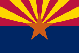
50 Days, 50 States; Day 3: Arizona

Current Flag: 

Flag of Arizona.svg

I think this flag is pretty okay. It’s not terrible but it’s not one of the great ones. According to Wikipedia, “The red and yellow…symbolize Arizona’s picturesque landscape…[and] the center star signifies copper production.” However, the blue doesn’t seem to represent anything. 

My Redesign: 

Image

I wanted a nice, simple flag for this one. I kept the original colors, but removed the blue, which didn’t seem to serve a purpose. I replaced the star with a circle, which is easier to see from a distance. 

50 Days, 50 States; Day 2: Alaska

Current Flag: 

Sorry for the bad quality!

I actually like this flag a lot. The blue and the gold combine nicely, and the North Star represents the state’s motto, “North to the Future.” I don’t really see any major things that I want to redesign in this flag. However, I must redo them all…

My Redesign: 

For this redesign, I kept the same colors, and the same idea of the North Star. I removed the Big Dipper and replaced it with an arrow/mountain, which represents Alaska’s mountains, but mainly its motto, “North to the Future.”

By the way: I still like the original flag better. However, I think mine is easier to draw.

50 Days, 50 States; Day 1: Alabama

Current Flag:

Flag of Alabama.svg

To me, this is one of the few state flags that is actually simple, good, and memorable. However, I see that attempt to sneak in the Confederate flag. Not cool, Alabama, not cool.

Redesign:

I made this with Scrontch’s Flag Designer. It’s good for simple flags. This one features a white field charged with a red cross, which is drawn from the original flag. It also features a cotton flower, a symbol of the south. I like this, because, unlike the Confederate Flag, it represents the region, but also gives remembrance to those who were enslaved in the past.

Sealand Redesign

So, I redesigned Sealand’s flag. Here’s the current one:

Image result for sealand flag

It’s okay, but I don’t like that the red area is bigger than the gray area. Also, to me, this doesn’t really stand out as much as some other flags, it just looks like a maritime flag. 

My Redesign:

Image

Again, I used Scrontch’s Flag Designer for this one. I replaced the gray with the black so it would stand out more, and I incorporated the Cross of St. Andrew, an element of the Union Jack (since Sealand was formerly part of Britain) in the design. 

I also designed a Royal Standard:

Image

It’s the same as my redesign, but it’s charged with a crown. The color blue is for the sea.

50 Days, 50 States

From now on, for the next 50 days, I will be redesigning one new state flag every day. No matter what I think of this flag, I will redesign it and try to make it better. Each flag will have meaning and symbolism, but I will try to make them minimalistic.