50 Days, 50 States; Day 11: Hawaii

Current Flag:

Flag of Hawaii

This is actually okay. The Union Jack represents Hawaii’s historical relationship to the UK, and the stripes don’t seem to represent anything.

Unofficial Current Flag:

us-hi}km.gif (691×432)

This is called the Kanaka Maoli flag. It’s the old flag that predates the above flag. The symbol in the middle is called a kahili, it’s part of the Royal Standard of the Kingdom of Hawaii.

My Redesign:

This took me a while. I kept elements of the original flag and the unofficial one. I squared the Union Jack so that it would represent the first flag of the US, which had a square Union Jack, and the historical relations between Hawaii and Britain.

50 Days, 50 States; Day 10: Georgia

Current Flag:

Flag of Georgia (U.S. state).svg

Ecch…this is literally the Stars and Bars (Confederate Flag) with an annoying seal on it. What the hell, Georgia? At least it doesn’t feature an actual Confederate flag, which their flags featured from 1956-2003. The 13 stars represent an excuse to glorify the Confederacy Georgia’s status as one of the original 13 colonies. I do like the motto, though.

My Redesign:

I kept the original triband. The stars represent the motto, which has 3 parts: “Wisdom, Justice, and Moderation.” The blue represents the US, which Georgia is obviously a part of, and it was also in the original flag.

50 Days, 50 States; Day 9: Florida

Current Flag:

Flag of Florida

This is a little bit of a knock-off of the Alabaman flag. It is the same design, just charged with the state seal. There is no symbolism in it that is non-Confederacy, other than the Seminole woman on the seal.

My Redesign:

Flag of New Spain

I thought that the Cross of Burgundy would represent Florida perfectly. The cross is mainly Spanish, but it has elements of St. Andrew’s Cross, a British symbol, as Florida was both a British and Spanish colony. I used approximately the same colors.

50 Days, 50 States; Day 8: Delaware

Current Flag: 

Image

Ugh. Another state seal flag. At least the colors are nice. Doesn’t seem to have a lot of symbolism. 

My Redesign: 

Image

The blue and buff represent the state, as they are the state colors, and the single star symbolises “The First State.” Sorry for the lack of symbolism. I couldn’t find anything that was super symbolic.

50 States, 50 Days; Day 7: Connecticut

Current Flag: 

Image

I don’t know what to do with this flag. It has a complicated seal and doesn’t seem to have that much symbolism. It looks like half the state flags. However, Connecticut seems to not have any official state colors. 

My Redesign: 

Image

I included the grapevine, and the three stripes represent the three original colonies that made up Connecticut. I also included the blue lines, because they looked cool.

50 Days, 50 States, Day 6: Colorado

Current Flag: 

Image

I can’t do this. This is one of the best flags in human history. It looks nice and has meaningful symbolism. “The blue is meant to represent the skies, the gold stands for the abundant sunshine the state enjoys, the white represents the snowcapped mountains, and the red represents the ruddy earth,” according to Wikipedia. I don’t know what to do!

My Redesign: 

Image

Ok, I’m a wimp. I centered the “C” but kept the colors and everything else and the same symbolism. If only Colorado had had a bad flag, then I would have gotten to actually make it better!

50 Days, 50 States; Day 5: California

Current Flag: 

image

This flag is okay, but there are two major things wrong with it. Firstly, it includes text. Secondly, it’s a bit too detailed to be seen from far away. Also, it doesn’t include any of the actual state colors, blue and gold. 

My Redesign: 

image

I used the same proportions in this redesign, but I removed the bear. I thought that was a little too detailed. However, I still included the elements of the star and the stripe. I also changed the colors to the actual state colors. The bottom stripe represents the gold that is, or was, found in California, and the blue represents the sky. 

50 Days, 50 States; Day 4: Arkansas

Current Flag: 

Flag of Arkansas

I don’t want to offend anyone here, but I really don’t like this flag. It has text on it, which just makes it look really bad. However, the main reason is because of its meaning. Apparently, the top star represents the Confederacy, and it’s easy to see the similarities between the two flags. The other stars’ symbolism is disputed, but the stars on the band represent Arkansas’ status as the 25th State. The diamond represents its status as the only diamond-bearing state (this has changed since it was written down in 1987). The colors are drawn from the American flag.

My Redesign: 

Image

In this redesign, I kept most of the design. However, I removed the text, which didn’t do anything, and I removed the twenty-five stars because of their lack of meaningful symbolism. The star in the middle is a replacement for the text, and represents the state itself. The diamond still represents the same thing, and the colors are still those of the national flag.

50 Days, 50 States; Day 3: Arizona

Current Flag: 

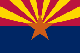
Flag of Arizona.svg

I think this flag is pretty okay. It’s not terrible but it’s not one of the great ones. According to Wikipedia, “The red and yellow…symbolize Arizona’s picturesque landscape…[and] the center star signifies copper production.” However, the blue doesn’t seem to represent anything. 

My Redesign: 

Image

I wanted a nice, simple flag for this one. I kept the original colors, but removed the blue, which didn’t seem to serve a purpose. I replaced the star with a circle, which is easier to see from a distance. 

50 Days, 50 States; Day 2: Alaska

Current Flag: 

Sorry for the bad quality!

I actually like this flag a lot. The blue and the gold combine nicely, and the North Star represents the state’s motto, “North to the Future.” I don’t really see any major things that I want to redesign in this flag. However, I must redo them all…

My Redesign: 

For this redesign, I kept the same colors, and the same idea of the North Star. I removed the Big Dipper and replaced it with an arrow/mountain, which represents Alaska’s mountains, but mainly its motto, “North to the Future.”

By the way: I still like the original flag better. However, I think mine is easier to draw.