Mississippi’s New Flag: The Good and Bad

Just to clarify: although I will talk about some things that I find bad in this new flag, I do not in any way prefer the original 1861 Magnolia Flag or the 1894-2020 flag to this one. So, in November, the Mississippian voters picked a new flag. Their old flag, which I won’t show here, featured the Confederate Battle Flag, and to many in the state, represented oppression and systemic racism. Before the election, there were really five flags that were finalists, and the best ones of those were combined into this flag, which is now the official flag of Mississippi.

Flag of Mississippi.svg

As I said in the title of the post, there are good and bad parts of this flag. Let’s start with the good parts.

Firstly, the flag is an improvement because it features no Confederate symbolism. After all, that was the purpose of the flag. This is really the most obvious thing about it, good or bad.

Secondly, the symbolism is much better and richer. The Magnolia represents Mississippi as the Magnolia State, and the blue represents the Mississippi River. The gold represents Mississippi’s rich culture, and the red represents “Hardiness.” The twenty stars represent Mississippi as the twentieth state, and the gold star which stands alone represents the Native Americans who first inhabited Mississippi. “In God We Trust” is the state motto.

Finally, this flag just looks better than the old one. I think that the original was a little too bright, and not original enough. The symbolism was just the Confederacy and the United States.

Now for the bad. Granted, there are not nearly as many bad things as in the original flag, but there are some symbolism and design elements that I don’t really like.

Mainly, the “In God We Trust” motto. I really don’t like how much Christian symbolism the US government endorses and creates, and I also just don’t like text on a flag. I see no reason to put the motto onto the flag other than to endorse Christianity (which the government shouldn’t do).

I also think that the magnolia is a bit too complicated. I don’t hate it, but I would prefer a less complicated stylized magnolia.

So, based off all of this, here is my ideal redesign of the Flag of Mississippi:

I made very slight changes to the proportions and the red and gold bars, but more drastic changes to the magnolia and the stars. For the magnolia, I just did a simple stylized flower based off of the magnolia flower. For the stars, I moved them to the gold bars, and I changed every star to the type made up of the five diamonds.

Redesigning European Union Flags, day 7: Denmark

Current Flag:

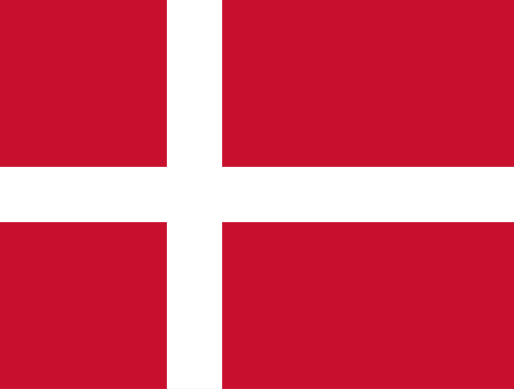
Flag of Denmark.svg

Another of the most beautiful European flags. According to legend, this flag fell out of the sky during a battle, but it really derives from a war flag of the Holy Roman Empire. It’s one of my favorite flags, along with the other Nordic Cross flags.

My Redesigns:

Redesign 1:

This redesign is based off of the Greater Coat of Arms of Denmark. I did the same thing that I did with the Czechian Redesign, removing all the complicated elements and keeping the basic structure and colors. I also shifted the design slightly so that it would keep with the Nordic Cross motif.

Redesign 2:

This flag is based off of the Coat of Arms of the House of Oldenburg, the first ruling family of Denmark. I think that it’s a good design, but I don’t like it as much as my first redesign, since it eliminates the Nordic Cross.

Redesigning European Union Flags, day 6: Czechia

Current Flag:

Flag of the Czech Republic

This is, honestly, one of the best flags in Europe. I doubt my design is an improvement. I think that the reason this flag is so memorable is that it is very recognizable without being a tricolor, so as not to be confused with another flag. I couldn’t find anything on the symbolism of this flag, but it’s really nice.

My Redesigns

Redesign 1:

For this redesign, I used the colors of the Coat of Arms of the Czech Republic without the detailed animals, and I put a star in the middle to represent unity between the Czech Lands.

Redesign 2:

In this redesign, I combined the flags of Bohemia, Moravia, and Silesia, the Czech Lands. Again, the star is to show unity. It also brings blue, the only Pan-Slavic color missing from this flag, into the design.

Redesigning European Union Flags, day 5: Cyprus

Current Flag:

I have never really liked this flag. I think that it’s because I don’t like having the shape of a country on its flag. Borders can fluctuate, even those with the sea. Also, this flag could look like a surrender flag if there was no wind. I think that the olive branch is quite nice though.

My Redesign:

No symbolism has changed at all. The white with the olive branch represents the peace between the Greek and Turkish Cypriots, and the orange represents copper deposits.

Redesigning European Union Flags, Day 4: Croatia

Current Flag:

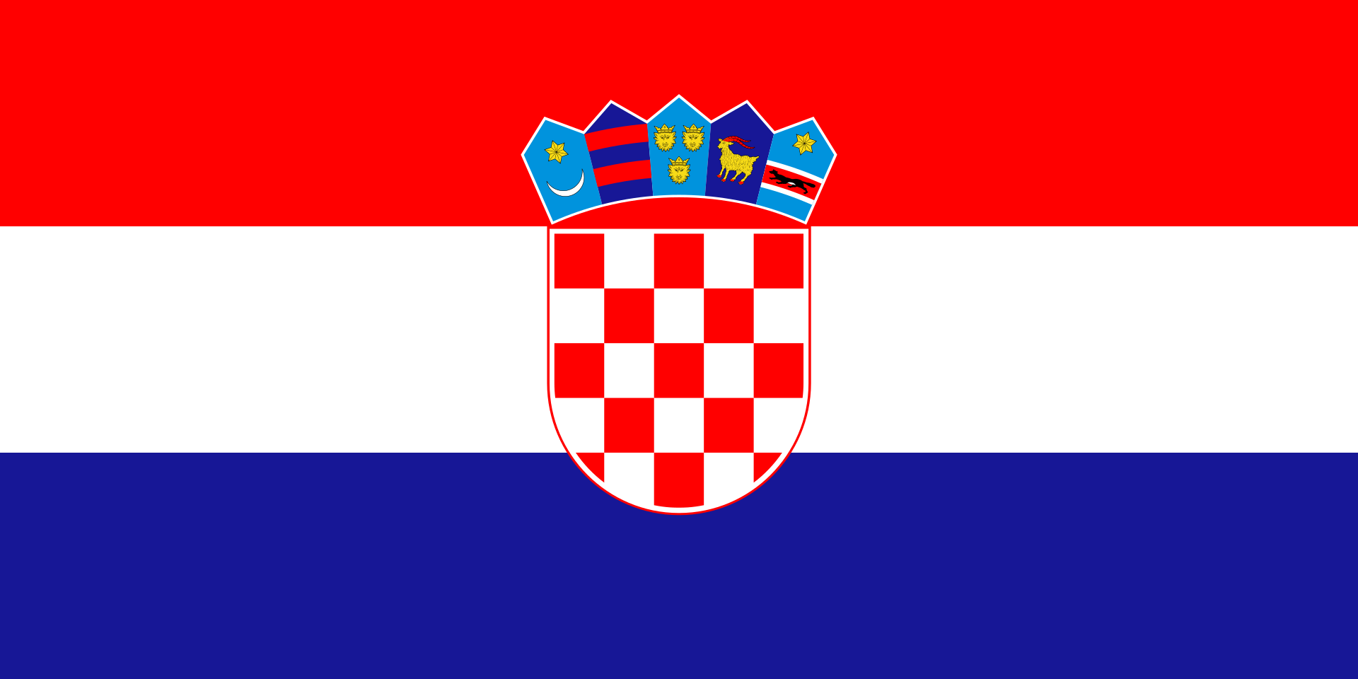
Flag of Croatia

I think this is an okay flag, but it’s easily confusable with the flags of other nations, such as the Netherlands and, to an extent, the other Slavic nations. The coat of arms in the middle isn’t too memorable either. I really like the crown of arms on top of the seal. The symbol on the far left is one of the early coats of arms of Croatia, and the others represent the regions of Croatia.

My Redesign:

I basically made a banner of arms of that symbol I mentioned earlier. I can’t really find anything on its symbolism, but I’m fairly sure that the crescent represents the Ottoman Empire. The star could possibly represent Hope, but I don’t know.

Redesigning European Union Flags, Day 3: Bulgaria

Hi, sorry I haven’t posted in a while, I’ve been a little overwhelmed what with all the news and the upcoming election, but here’s the next post of the EU Flags Redesigned Series.

Current Flag:

This is a really good flag, since it’s a tricolor, and I can’t make it any better. I can’t find anything about what the symbolism is, but the colors go really well together.

My Redesign:

As I said, I couldn’t make the flag any better, so I just added the lion from the Bulgarian coat of arms. I also changed the proportions of the flag to 2:3, of course.

Redesigning European Union Flags, Day 2: Belgium

Current flag:

Flag of Belgium.svg

Nice Flag! It’s a really appealing tricolor, so I can’t really make it better. The colors are taken from the unofficial former flag of Brabant. However, the proportions are really weird. 13:15.

My Redesign:

The basic design is taken from the Lesser Arms of the Royal House. I thought it looked kind of cool. The green band is a very simplified crown, and I actually don’t know what the stripes represent.

Redesigning European Union Flags, Day 1: Austria

Current Flag:

File:Flag of Austria.svg

This flag is a Tricolor, so I will say nothing bad about it. The story is really great too. Here is a quote from Wikipedia: “According to legend, the flag was invented by Duke Leopold V of Austria as a consequence of his fighting during the Siege of Acre. After a fierce battle, his white surcoat was completely drenched in blood. When he removed his belt, the cloth beneath remained unstained, revealing the combination of red-white-red. So taken was he by this singular sight that he adopted the colours and scheme as his banner. The incident was documented as early as 1260.” Great symbolism, great story.

My Redesign:

This is essentially a simplified version of the State Flag of Austria. The eagle represents Austrian Sovereignty.

Redesigning National Flags with the Union Jack

Australia

Current flag:

A blue field with the Union Flag in the upper hoist quarter, a large white seven-pointed star in the lower hoist quarter, and constellation of five white stars in the fly – one small five-pointed star and four, larger, seven-pointed stars.

Ugh. There are many problems with this flag, but at least it has symbolism. The Commonwealth Star, under the Union Jack, is a symbol of Australia, and the Southern Cross represents the Southern Hemisphere.

My Redesign

I kept the Commonwealth Star, and used the national colors of Australia, green and Gold. I am going to try to use a Canadian Pale for all my redesigns of the flags of Commonwealth Nations, to have a sense of similarity between them.

Fiji

Current Flag:

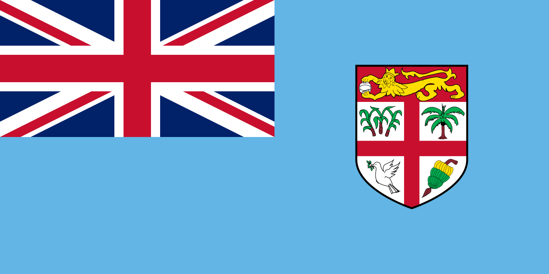
Flag of Fiji

This flag hurts my eyes. The Lion and the Cross represent the U.K., which colonized Fiji, and the bananas, cacao bean, sugarcanes, and palm trees represent Fiji’s natural resources. The dove represents peace.

My Redesign:

I used all 3 national colors of Fiji, and a Canadian Pale. The cacao bean still represents resources.

New Zealand

Current Flag:

Flag of New Zealand.svg

This Flag is too similar to that of Australia, and the symbolism is almost the same, excepting the Commonwealth Star, which does not appear in this flag.

My Redesign:

I used 2 of New Zealand’s National colors, red and blue, with a Canadian Pale. The charge is the Southern Cross, giving this flag the exact same symbolism as the original.

Tuvalu

Current Flag:

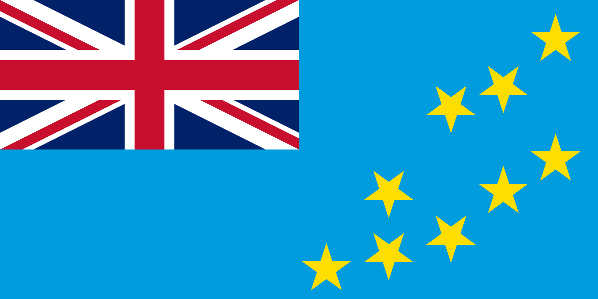
Flag of Tuvalu

This is actually an okay flag. The stars are arranged like the islands of Tuvalu, and they represent their respective islands. I will use the same symbolism in my redesign.

My Redesign:

This flag is based off of the 1996-97 Flag of Tuvalu. It is essentially that flag, but with the National Seal removed. It was such a good core design, I broke from the Canadian Pale design.